Results from my Study
This is the second in the series of articles on the 4% Rule. If you have missed out on the first you can find it here, the second can be found here.
In the first article I introduced the origins of the so called 4% Rule which is based on the Bengen and Trinity Study (B&T Study). I talked about those two studies in detail along with links to the source material for interested readers.
In the second part of the series I tried to show some of the flaws of the studies and proposed an alternative – The Monte Carlo Method.
In this article I present some of the results from applying these methods. Like all articles in this series this one too is going to be fairly academic so please make yourself comfortable with a beverage of choice… I’ll wait.
My Data-set
The Data that I use for the analysis are the annual returns in percentage terms on the S&P 500 Index. I chose the S&P Index as a proxy for a broad based Stock or Equity portfolio.
I have used data for the past 92 years starting off from the Year 1928 to Year 2019. At the time of this writing, I used the returns until the 20th of November 2019 Instead of 31st December like in all other annual returns.

The chart above shows the annual returns of the S&P 500 as bars on the Y-Axis with the Dates on the X-Axis. The dates on the X-Axis are ordered from 1928 to 2019. A quick visual inspection tells us that there are more bars above 0 than below 0 , thankfully that is 🙂
The other thing to notice is the fact that there is no particular trendline per se in the returns. This means that the returns are mostly random. I think this becomes visually more evident on a line graph as shown below.

It is important to know the distribution of returns. The chart below shows the distribution of returns grouped into buckets of size 10% each.
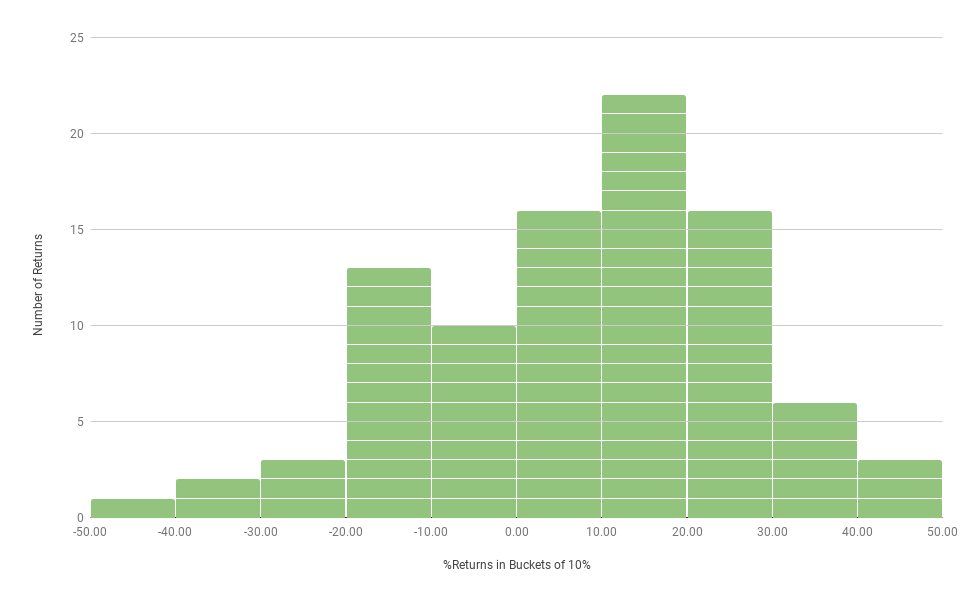
You may notice that most of returns in the last 92 years have been in the range of 10%-20%. The next two most frequently occurring annual return ranges are between 0%-10% and 20%-30%.
The distribution looks like the bell-curve with the number of instances of annual returns decreasing as we move far away from the centre (Mean, Median).
Now that we have taken a look at the data-set let us run some analyses on it.
Just the Dollar Returns
Just to get started on the analysis, I ran a baseline scenario.
Scenario 0 –
- Invest 2M$
- Time period = 30 Years
- No Withdrawals
I used the Monte-Carlo Simulation approach outlined in the previous article. So from the basket of 92 returns, I randomly picked (Assuming that any return is equally likely) 30 returns and created a sequence of 30 annual returns. I calculated the annual returns on that 2M$s for each of the 30 Years and plotted the returns as a line graph. I repeated this exercise 10,000 times.

Please do not be overwhelmed by how busy and tangled the lines look, the point of plotting 10,000 lines is to give some visual feedback on the general trend. You can see that the average of the 10,000 scenarios at the end of year 30 should be somewhere between 0-50M$s.
These are the calculated summary of the returns:
- The mean or the average Value of the Portfolio is 14.57M$s
- The Max Value of the Portfolio is 223.58M$s
- The Min Value of the Portfolio is 0.18M$s (~180,000$s)
This basic scenario helps us to put all the upcoming scenarios into context. So, things are looking good so far. Putting in 2M$s and not withdrawing anything for the next 30 years does well, at least you would not go bankrupt even in the most worst case scenario out of a 10,000 Scenarios. This is great news indeed.
The 4% Rule
This is the scenario that you may be waiting for all along. The scenario of the 4% Rule.
Scenario 1 –
- Invest 2M$
- Time period = 30 Years
- Withdrawals = 4% (with 3% Annual Inflation Adjustments)

These are the calculated summary of the returns:
- The Mean or the Average Value of the Portfolio is 3.77 M$s
- The Median Value of the Portfolio is 1.23M$s
- The Max Value of the Portfolio is 131.47M$s
- The Min Value of the Portfolio is -22.54M$s
So the numbers do not look so bad afterall, right? The average value of the Portfolio at the end of 30 years in spite of 4% withdrawals and 3% Inflation adjustment is an average of ~3.77M$s over 10,000 scenarios. Even the median or the central Value or the Middle value of the Portfolio over 10,000 scenarios is 1.23M$s.
But is it hurrah!!! To the 4% Rule then? Not quite. Remember, the 98% number? That was the survival rate in the B&T Study. The percentage of portfolios that survived over the period of 30 years. Survival as defined as the portfolio value not going below zero.
So, what percentage of portfolios survived in this simulation using the 4% Rule???
Well, surprise! It is not 98%, not even 90%
The Survival rate is a measly – 61.45% !!!!!!
Let that sink in a bit!
If you had followed the 4% Rule then there is only a little over 60% of a chance that your portfolio will survive. This number is so vastly different from the 98% of the B&T Study that I was in a state of disbelief for a long time.
Is there any other rule out there? Like the 3% Rule?
Just out of curiosity I checked for the portfolio Survival Rate
Scenario 2 –
- Invest 2M$
- Time period = 30 Years
- Withdrawals = 3% (with 2% Annual Inflation Adjustments)
Does the Survival Rate Improve? Well it does improve, and by quite a bit actually.
The Survival Rate with a 3% Withdrawal at 2% Annual Inflation Adjustment is 85.79%!!!
This is fairly drastic, about 25% points of improvement!!!
So, If 3%Rule is better than the 4% Rule then the 2% Rule should be Rad!! Let’s check it out.
The 2% Rule!
Scenario 3 –
- Invest 2M$
- Time period = 30 Years
- Withdrawals = 2% (with 2% Annual Inflation Adjustments)
The Survival Rate is….. 96.09%!!!!
There you have it! Something finally in the range of the B&T Study. Only a 2% Rule can realistically save the day it seems.
What does it all mean to you?
I think, blindly applying the 4% Rule depending on the B&T Study is a mistake. The FIRE movement is quite recent and is often criticized as a bull-market phenomenon.
If we had say 5 years of bear markets then all of the hype might die away leaving behind only the ones that have FAT FIREd with rest of the FIREd people going back to a tough job market.
My study showed that FAT FIRE with 2% and below withdrawal has a high (~96%) chance of success. Does that mean that FAT FIRE is the actual FIRE? Does that mean that 2% Rule is the new 4% Rule? Honestly, I am not sure.
I have more questions than answers. Firstly, my study is not complete, I have not included bonds in my portfolio, may be having bonds with annual rebalancing can increase survival rates? (Does not mean that my study is wrong, the B&T Study also had a case where they had 100% Stock portfolio, just like mine and still incorrectly showed a >98% survival rate!!!)
If the Inflation adjusted withdrawals are to be 2% then it opens up different asset classes like the TIPS(Treasury Inflation Protected Securities), Gold, Real Estate etc. for discussion. Should these be part of the portfolio? If so, then how much?
These and many other questions are on my TO-DO list for next year.
Stay tuned!!! Happy New Year 2020!!!
Hmm, these numbers seem so different than the ones that I’ve seen run elsewhere (like on Early Retirement Now). Do you know what accounts for those differences?
One interesting thing to try might be to pair the market years with inflation from those years. In years where there was a high inflation, there was typically high bond returns as well, which helps even things out. Pairing high inflation with a low stock market year might cause things to be off.
Thank you for the kind reply.
I have seen the numbers at ERN and the source cited there, the Portfolio Visualizer. (https://earlyretirementnow.com/2019/07/10/monte-carlo-plan-for-retirement-guest-post-gasem/#more-40782)
I believe the source of the difference is the methodology of sampling. The above sources use bootstrapping based on a single year or a block bootstrap. I do not use any bootstrapping and do a pure random sampling. I tested the model used in ERN using the same parameters as I had, 2M$s , 4% Inflation Adjusted withdrawals for 30 years, their model yielded 86% survival rate. In fact if i stress test their same model with just 3 years of bad returns in the sequence then the survival rate falls to ~38% !!!!
Inflation pairing is a good idea but i think it will only reduce the survival rates, because 1) Inflation affects withdrawal rates 2)It is mostly positive 3) the US has not seen double digit inflation in the last 40 years, I have assumed constant 3% inflation which is quite relaxed IMO.
you are absolutely right about bonds, i need to test for it. If the survival improves then the importance of having bonds along with rebalancing can become the cornerstone of FIRE!
Comments are closed.